Weekday observations of tourists taking photographs of the Empire State Building offer evidence that I am not a tourist; I work here.
Audience: I am the primary audience for this data set and visualization as I’m charmed by the way tourists interact with ‘my’ city. I’m a relatively recent transplant to NYC, and feel so lucky to have landed a job in midtown Manhattan. I walk past the Empire State Building twice a day and often see people taking photos of the landmark. My first few months at the Grad Center I found myself humming the theme from “The Mary Tyler Moore Show” …. ‘you’re gonna make it after all” <hat toss>.
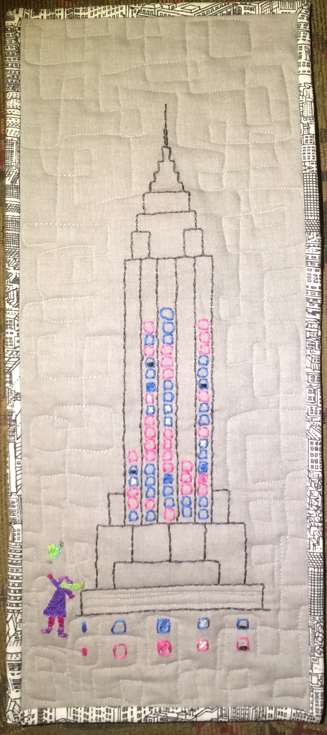
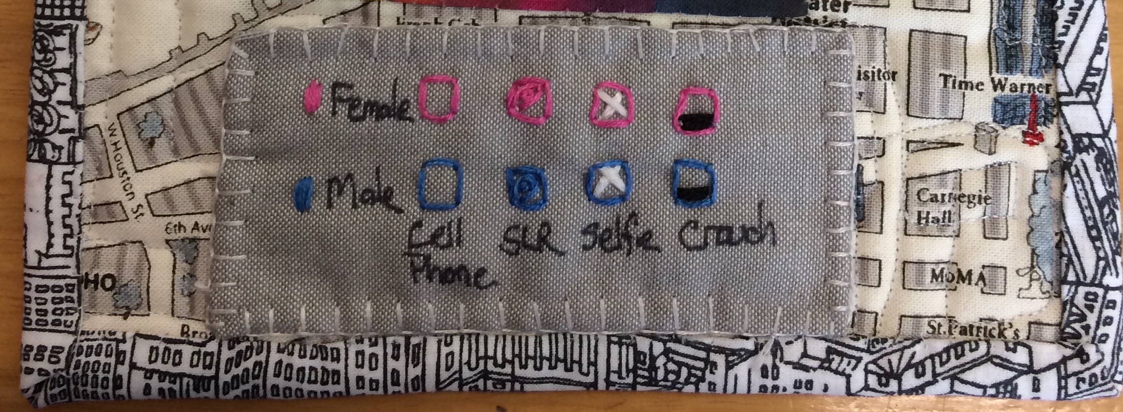
Description: During my morning and evening commutes along 34th Street between 5th and 6th Avenues, I coded my observations of people taking photos of the Empire State Building. This was the obvious subject of the photos because the camera lenses were pointing up at a steep angle. I developed a coding system that tracked the following variables: 1) Cell phone vs. SLR Camera, 2) Male vs. Female, 3) number of people in the group, 4) selfie-style, 5) crouching. I wasn’t exactly sure which elements I would be able to visualize, so I coded all just in case. I collected data for 2 weeks from October 7 to October 18, 2019. Ultimately, I visualized three dimensions: Day of the week, Male/Female and type of camera used. Two other details are included in the tool tips (Selfie-style and Crouching).
Because the whole point was to illustrate that I work in midtown at a regular job, I added rows of data for a Saturday and Sunday to force those column.
I found cell phone and SLR camera .png icons and learned how to create a new ‘shapes’ folder to use in Tableau.
Cell phone icon: ![]()
SLR Camera icon: ![]()
By hovering over each camera icon in the visualization, the tooltip displays a statement about how to read that particular data point.
There are two tabs in the Tableau visualization, an intro and the data
URL for Visualization (incase Embed doesn’t work): https://public.tableau.com/views/ESB_15715057872290/Story1?:embed=y&:display_count=yes&:origin=viz_share_link
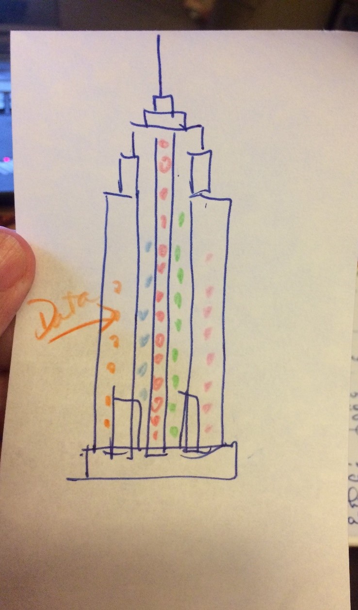 Original visualization sketch
My plan all along was to watermark the Empire State Building behind the data, however I wasn’t able to get that to work in Tableau (this has something to do with the way my date column is calculating, and I haven’t figured out a way around it yet). Of course, in an embroidered textile, I have free reign to create this any way I wanted. The title “I made it!” is a play on words about making the textile as well as ‘making it’ in the city. In the art quilt, the Empire State Building representation was modified to allow for 5 columns of data. The small icons could be further modified to represent 2 additional dimensions: ‘Selfie-style’ photo and ‘Crouching posture’ photo. Because this is an art piece, I took the liberty of placing the legend on the back rather than the front. Referencing the “Dear Data” postcards, that inspired this project.
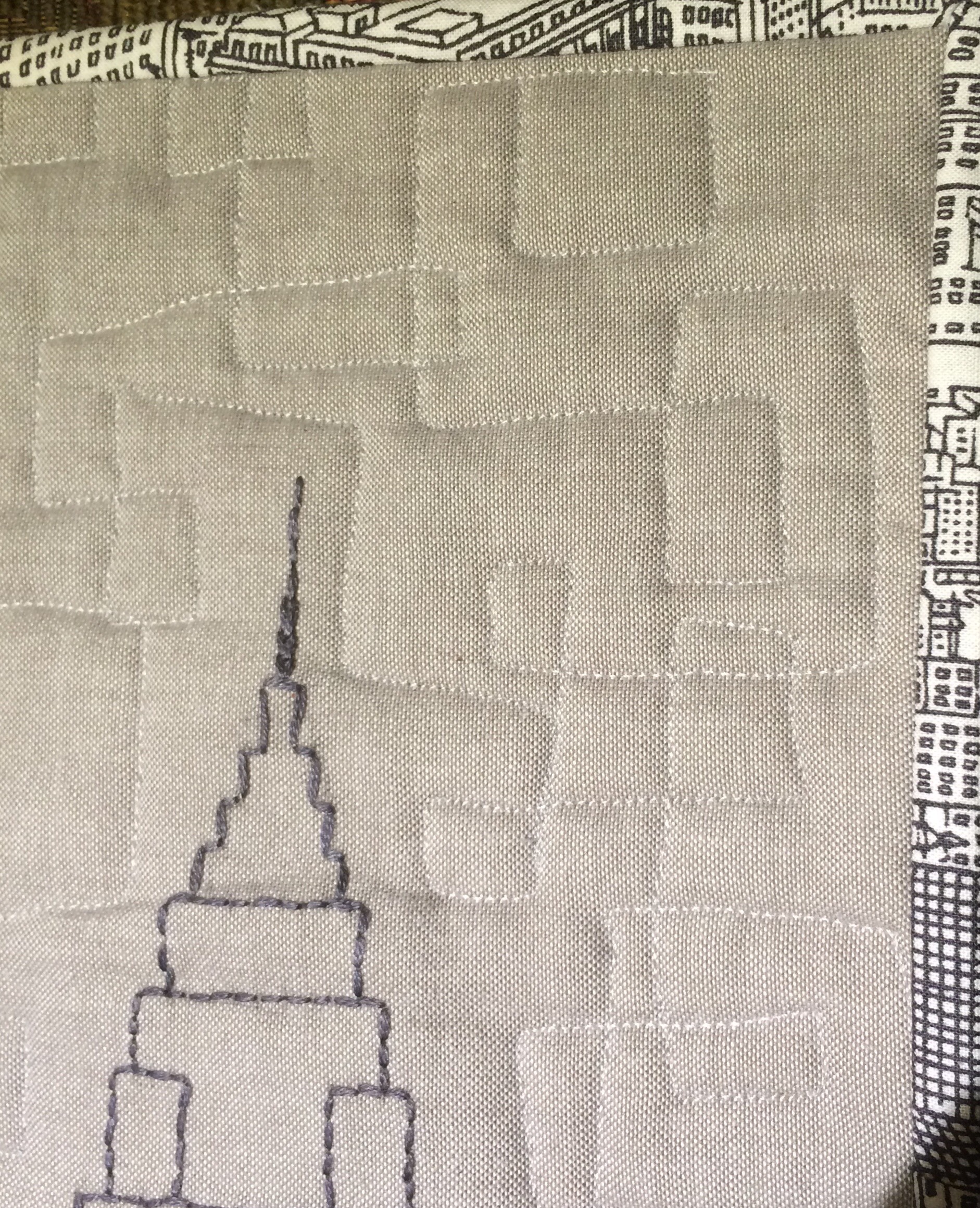 Front detail showing quilting
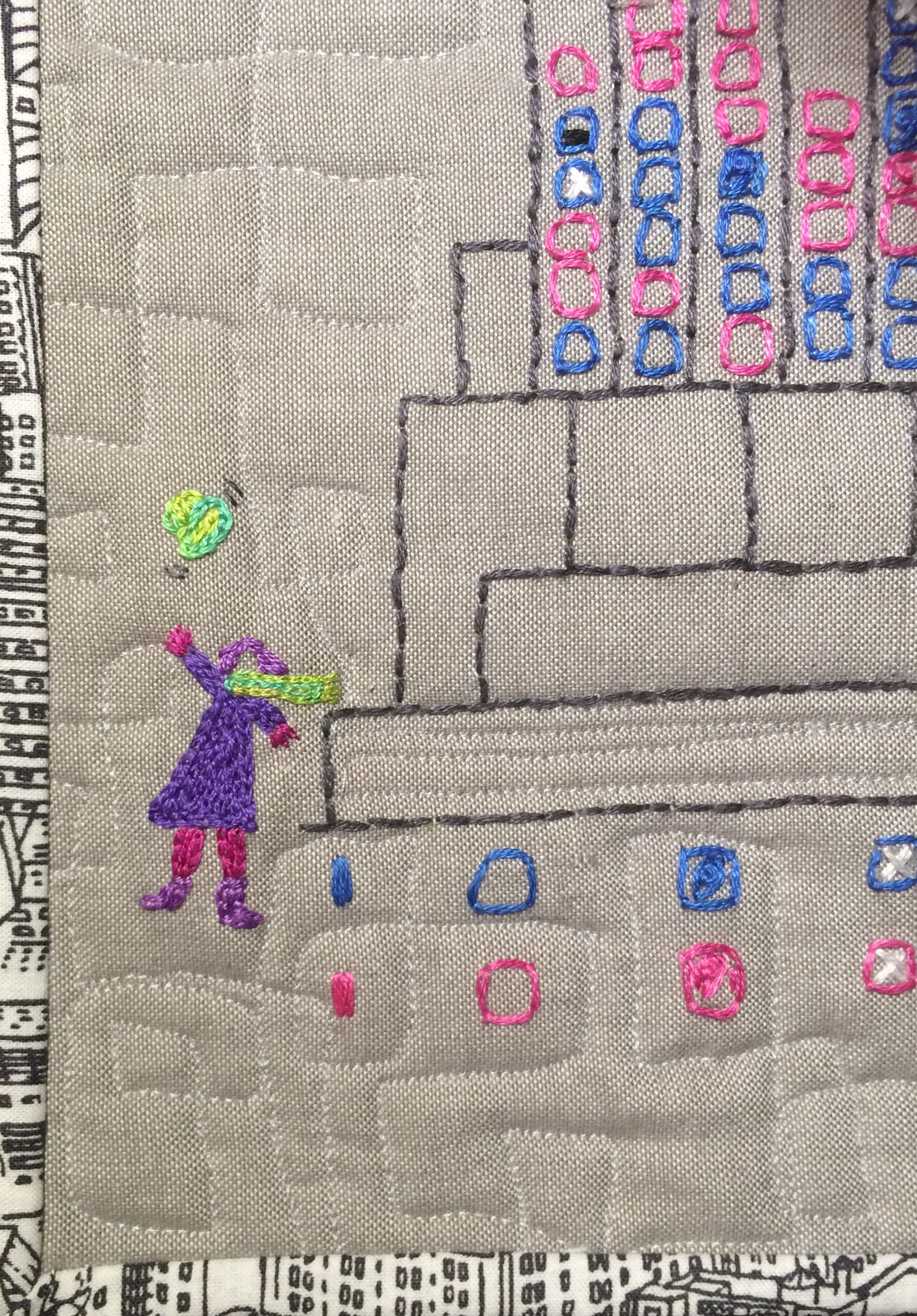 front detail showing my ‘hat toss’
 back detail showing legend
Data Life Cycle Notes: I learned that even though my coding was pretty simple (M/F, Cell/SLR, Y/N for crouching and selfie) I originally entered my data in mixed case (sometimes capital, sometimes lower case letter) which created a different ‘value’ in Tableau. Also there were times when I added a space after the code in Excel. I repaired and reconnected to the source data multiple times. All of this points to the need for using Excel Data Validation in future projects. I also made extensive use of Aliases to get the tool tip to display in a friendly format.
Also, I discovered uneven results due to a work holiday that affected a collection day, and rain, which affected the number of tourists taking photos (although there were still a few brave folks out there). The observations were substantially affected, so I explained that on the dashboard.
Next Steps: I do want to learn how to insert a photo in the background of a graph. I tested this before suggesting it, and it worked, but there is a hang up with the type of data elements that float above it. I will have to learn more about Tableau to make it work. I also want to explore illustrating additional dimensions as I did in the embroidery project. Again, not sure if Tableau can do it. It may require recoding, and making come combined values – for example, make Cell phone, Cell phone Selfie Style, and Cell phone Crouching 3 different codes in the same dimension.
I know I will continue to visualize data in textile art, so there will be more of that in the future. I hope to grow as an artist so the data doesn’t really look like a chart.