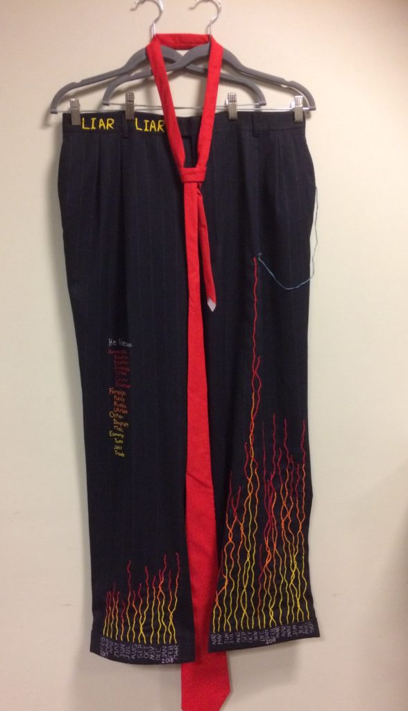
The current occupant of the White House lies nearly every time he communicates with the American people. We need to document his lies so that it never becomes ‘normal’ for our politicians to speak with us this way. I create data visualizations in textile. This is my piece called “Liar Liar”.
I chose to use the Washington Post Fact Checker data that tracked Trump’s false claims since his inauguration in January 2017 through September 2019. https://www.washingtonpost.com/graphics/politics/trump-claims-database/
On their site, the data is displayed in 3 ways: as an aggregate number, daily or by month. The user can also see the total or data for one of 15 or so categories. Although I requested access to a file I could download, I never heard back from the various people I wrote to at the Washington Post, so I manually recorded the monthly data by category
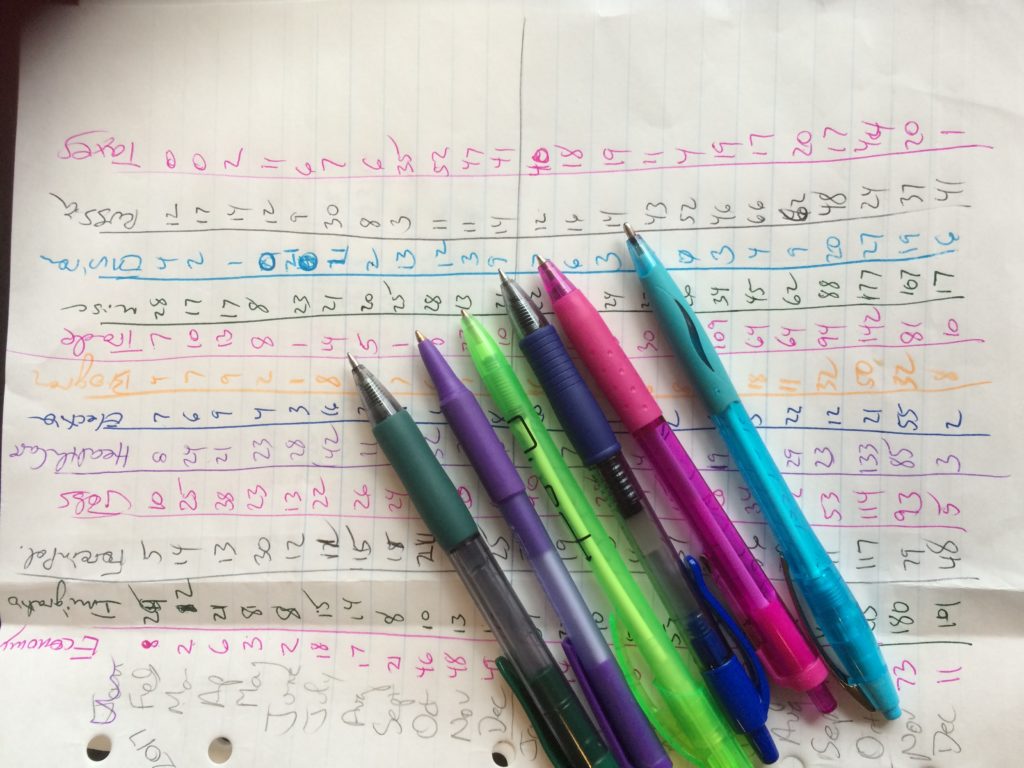
Then this was entered into an excel sheet and I had to decide how to combine categories for best effect. I learned in our first blog post that less is more in terms of telling story, so I wanted to limit this to 4 categories, and ultimately combined them into Domestic Issues, Foreign Issues, Money-related issues and Other Issues.
I opened this into Tableau to play with color placement for best ‘flame like’ effect. It was a good thing I did because my first inclination was to place the red on the bottom of the stacked bar chart. Since it didn’t look right, I found this piece of clip art to inform proper flame color placement. The Red-Gold color palette in Tableau provided the colors to match the clip art.

A Salvation Army store in Astoria provided just the right pants for this project. I knew I wanted a very large sized men’s pants because I looked up Trump’s clothing size and found estimates that he is a 46 – 50 pant size based on height and observed weight as reported by police officers who do this for a living. https://www.quora.com/What-size-suit-does-Donald-Trump-wear I also wanted to use a pinstripe suit fabric for the reference to ‘big business’ and because I thought it would work well in a graph representation, and help me keep those flames lined up. I also liked the cuffed pants, because it gave a natural difference between the data and the X-axis.
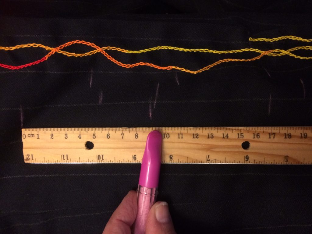
Next I had to create a scale to translate the tableau stacked bar chart into embroidered lines. I decided that the tallest line would set the scale, and selected a point on the pants to which that line should reach. I measured from just over the cuff to that point and found it was about 80 cm – using cm because it would be easier to do math in base 10, than in inches which are divided into 4ths or 8ths. I divided 1189 (the highest number of lies) by each number from 75 to 80:
| 1189 / 75 = | 15.853 |
| 1189 / 76 = | 15.645 |
| 1189 / 77 = | 15.442 |
| 1189 / 78 = | 15.244 |
| 1189 / 79 = | 15.051 |
| 1189 / 80 = | 14.863 |
I found that if I use 15 lies per centimeter the tallest line will be 79cm tall.
Then I applied the same scale to the shortest line to make sure it wasn’t too short, to find that 114 / 15 lies = rounded to 8 cm. That was a reasonable height.
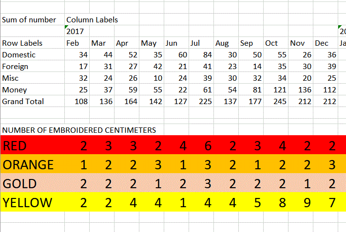
Once I had the scale, I had to create an embroidery pattern that translated each category into number of centimeters of embroidery in that color. I used pivot table in Excel to aggregate my data by month and highest level category. Then I copied the data out of the pivot so I could write formulas with it, and finally divided each number by 15 to get cm. I color coded the rows of data to keep my embroidery pattern clear.
In deciding how to transfer the pattern to the pants I tested various marking tools and selected my pink tailors chalk, as it left a line but easily wiped off. I worked on the data from a few month-lines at a time, marking the 4 color sections using cm markings on a ruler. The lines start and end lined up against the right or left side of the pinstripe, but meander to create flame movement.
I decided to embroider the month names in gray because we had discussed some color choices in class and Professor Michelle Sweeney said that Gray is the color of choice now for labels, that it presents as professional. I selected a gray that is a neutral tone against the navy blue.
The legend on the pant leg shows the grouping of Washington Post categories into the 4 categories I created for this project, which are not available on the Tableau version. Although there is plenty of fabric space above the knee, I chose to place it there so the tallest line would be taller even than the legend.
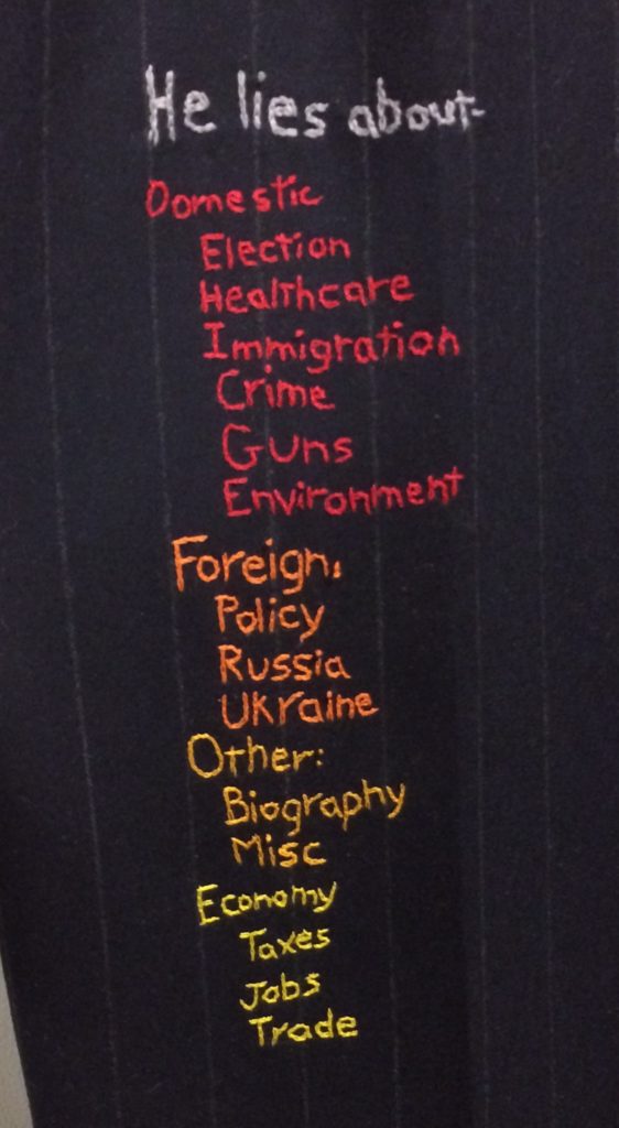
The name of the project, “Liar Liar” is embroidered on the waistband, representing the ‘header’ area on a traditional tableau chart. I chose yellow to tie the color at the bottom of the bar chart with this high point on the pants.
Because this visualization did not include tick marks on the Y-axis, I needed to include some way to read the chart. Of course one option was to simply leave it without actual values, because the point can be made that Trump is lying at an increasing volume, even without knowing the scale. But because I had done all the work to accurately represent real numbers, I wanted the audience to be able to discover those numbers. At first I thought to include a cm tape measure with the pants on display and include a scale mark (1 cm = 15 lies), but ‘15’ is a tricky number to expect audience to calculate in their heads. To change this to a 10x measure, I had to create my own custom tape measure. Using simple formatting in excel, created the following data:
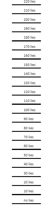
I prepared a full page of these columns such that they could be combined into one long tape, and also included project data such my name, date and data source.
I printed this a number of times, adjusting the pixel row height, until the 30 lies tick mark was equal to 2 cm on a ruler.
Next I printed the page on fabric using two methods to see which worked better. In one, I prepared a piece of fabric for printing on a laser printer by cutting it to printer paper size and ironing to the waxy side of freezer paper (that is the stuff butchers use to wrap meat). This stiffens the fabric just slightly and allows it to be fed into a standard desktop laser printer. This worked well, but the printing was a bit blurry. This can be improved by using a higher thread count fabric in the future.
The second method uses a specialized product that is fabric with an iron-on glue on the back. This sheet of fabric-paper can only be used in an inkjet printer because the glue will melt in a laser printer. Finding an inkjet printer was a challenge because it is old technology at this point, so special thanks to the Assistant Program Officer of the History program at CUNY Grad Center who offered the use of her printer for this project.
Once the measuring tape was printed in the two methods I constructed the tape measures and ironed on, then sewed on the marking lines. If this were to be on display in some place where many people would be touching this part of the project, I would completely reconstruct this by having the tape measure printed whole at a fabric printing house such as Spoonflower.
During the class presentation, I received feedback on these items which I addressed as described below.
- 1) Its not obvious who the ‘Liar’ is. Indicate ‘Trump’ in another way
- 2) Annotate the outlier since everyone asks what political event occurred at that time.
- 3) Stiffen the front cuffs so the graph lies flat
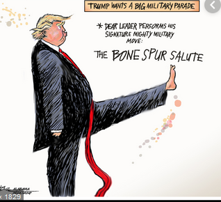
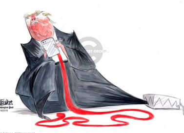
To address the issue of Trump not being identified, I created a very long red tie. I’m referencing the long red tie often seen in editorial cartoons such as these. Where even without words, we know they are invoking Trump:
I found a tie pattern here: https://sewguide.com/tie-pattern/ and watched this youtube video from MadeEveryday to learn tie construction techniques: https://youtu.be/DOKiRQDH3Sc Still some observers thought it was a normal sized tie, so if this were to be on display again, I would make the tie even longer so it drags on the floor.
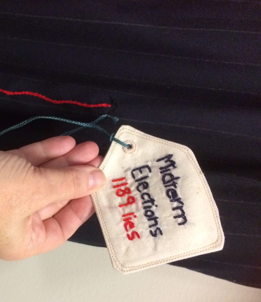
To annotate the outlier – tallest data line in October 2018 – I created a fabric tag in the shape of an item price tag, embroidered the words “Midterm Elections 1189 lies” and attached it via a string, like one might find on a piece of clothing, but attached to the top of the line, like one might find an annotation in tableau. The string is long enough to allow the tag to be stored in the pocket, thus activating another element of the pants.
Stiffening the front cuff was accomplished with a bit of Timtex ™ – a very stiff interfacing, usually found in construction of handbags, zippered pouches or other stiff sided fabric items. I tucked a hem sized piece into the cuff and applied it with the iron-on coating. I also ironed out the front crease to give a flatter look to the entire pant leg.
Finally, the piece is hung using two gray hangers, again the color gray selected to match the axis text color. I am using two hangers both for stabilitiy, but also to emphasize the width of the pants. I use command-strip ™ hooks affixed 4.5 inches apart as high up on the wall as I can reach.